1. Introduction: The Next Evolution of Web Design
The world of web design is constantly evolving. From static pages in the early 2000s to dynamic, mobile-responsive layouts today - each phase has reshaped how users interact with the web. Now, we're entering another exciting chapter: designing websites for foldable and dual-screen devices.
As smartphones like the Samsung Galaxy Z Fold, Microsoft Surface Duo, and Oppo Find N gain popularity, businesses and developers need to rethink what "responsive" truly means. Traditional responsive design focuses on scaling layouts for different screen sizes - but foldable and dual-screen devices introduce new challenges, such as hinges, multiple viewports, and dynamic orientations.
For businesses aiming to stay ahead of digital trends, understanding and preparing for these form factors is crucial. At Antsglobe Technologies, a leading website designing company in India, we help brands design and develop websites that are not just mobile-friendly, but future-ready - adaptable to any screen, fold, or orientation.
2. Why Foldable & Dual-Screen Devices Are the Future
-
2.1 The Growing Market for Foldables: According to Statista, the foldable smartphone market is projected to exceed 50 million units by 2028. Tech giants like Samsung, Google, and Microsoft are heavily investing in foldable displays - indicating a long-term industry shift.
-
Revenue Loss: Downtime caused by cyberattacks.
-
2.2 Changing User Experience: Foldables bring multi-tasking and immersive viewing experiences to users. Whether it's opening two apps side-by-side or extending a video seamlessly across two screens, these devices redefine convenience.
For web designers, this means one thing - designing adaptive layouts that can adjust intelligently to both single-screen and expanded dual-screen modes.
3. Understanding Foldable & Dual-Screen Devices
 Image source: Android Developers
Before diving into design, it's important to understand how these devices behave.
3.1 Types of Foldable Devices
-
1. Book-style foldables: e.g., Samsung Galaxy Z Fold, which opens horizontally.
-
2. Clamshell foldables: e.g., Motorola Razr, which opens vertically.
-
3. Dual-screen devices: e.g., Microsoft Surface Duo, which has two separate screens divided by a hinge.
3.2 Screen Postures and Spanning Modes
These devices can exist in multiple postures:
-
Single-screen mode (folded)
-
Dual-screen expanded mode (unfolded)
-
Tent mode
-
Book mode
-
Flat (tablet-like)
Each posture creates unique layout challenges that go beyond conventional responsive breakpoints.
4. Technical Foundations: Making Websites Work on Foldables
4.1 CSS Viewport Segments
Foldable devices expose viewport segments, which represent each visible area separated by a hinge. CSS lets you target these using media features such as:
This helps control how content appears on each segment.
4.2 Screen Spanning and Hinge Awareness
Avoid placing important UI elements directly under the hinge. Designers can use environment variables like env(fold-top) or env(fold-left) to position elements safely.
4.3 JavaScript Visual Viewport API
You can use JavaScript to detect viewport segments dynamically:
This allows responsive layouts to update instantly when the device folds or unfolds.
4.4 Progressive Enhancement
Since not all browsers support foldable APIs yet, progressive enhancement ensures basic responsiveness for all users while unlocking advanced layouts for compatible devices.
5. Design Best Practices for Foldable & Dual-Screen Devices
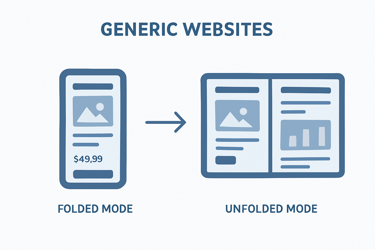
5.1 Adopt Adaptive Layout Thinking
Responsive design adjusts layout sizes. Adaptive design changes the structure of the layout itself based on available viewports. For example, an e-commerce website could show:
-
A single product view on a folded screen
-
A two-panel layout (product + cart) on an unfolded screen
At Antsglobe Technologies, we specialize in adaptive and responsive web design services that scale gracefully across all devices.
5.2 Keep Critical Content Visible
Users might view your site on only one half of a foldable device. Ensure navigation, CTAs, and key visuals remain accessible and not hidden behind hinges or folds.
5.3 Enhance Multi-Window and Multi-Tasking Support
Foldables allow multiple apps or browser tabs side by side. Design with content independence in mind - each pane should function fully on its own.
5.4 Orientation Transitions
As users fold or unfold devices, the screen changes orientation dynamically. Smooth transitions are key. Use CSS transitions and JavaScript to handle reflows seamlessly.
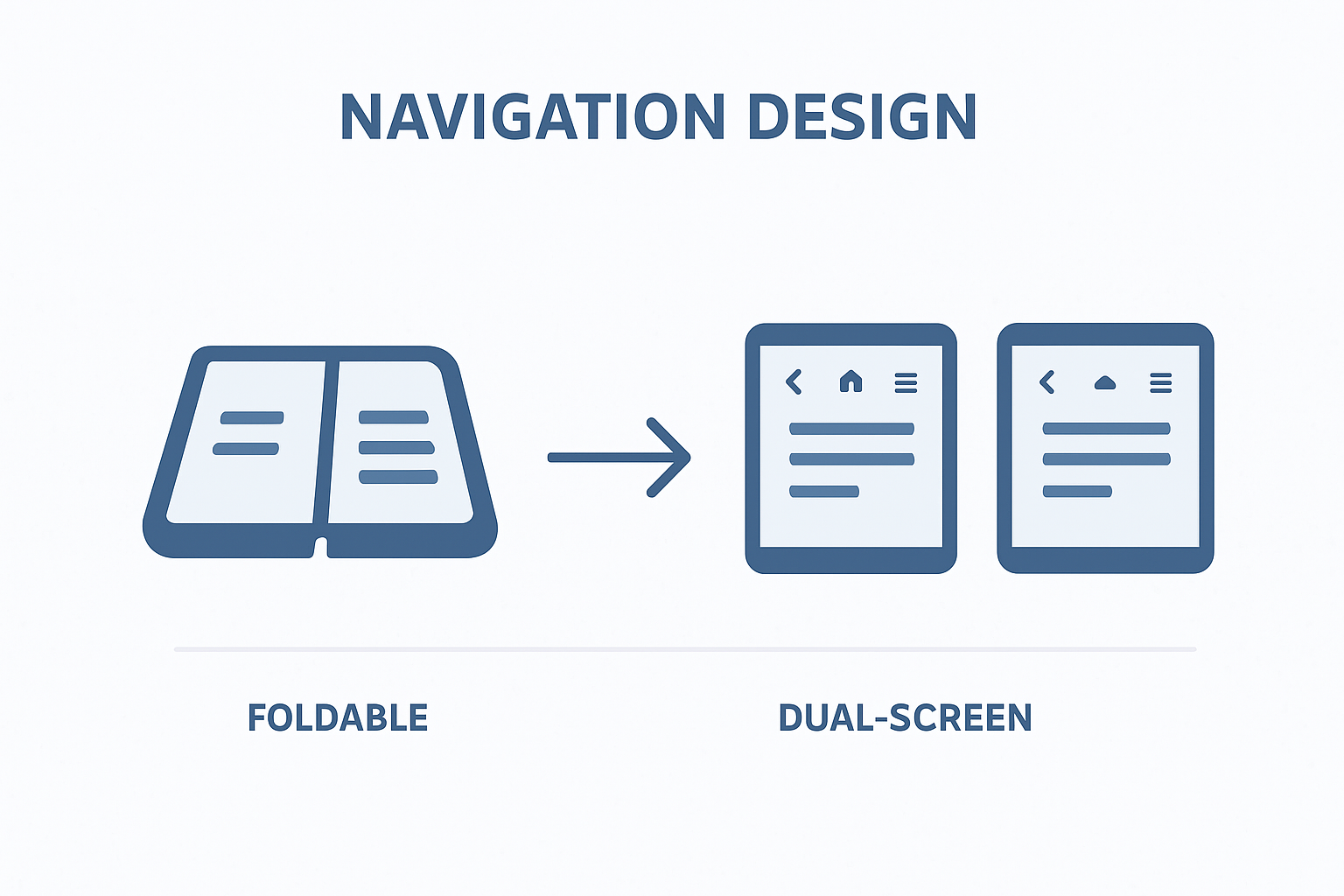
5.5 Rethink Navigation Patterns
Dual screens offer opportunities to separate navigation from content - for instance:
-
Left screen: navigation menu
-
Right screen: page content
This improves usability, similar to desktop UI but optimized for touch.
5.6 Testing on Emulators
Testing is critical. Use tools like:
-
Microsoft Surface Duo Emulator
-
Samsung Remote Test Lab
-
Chrome DevTools (Device Mode)
At Antsglobe Technologies, our development team tests across all major browsers and device emulators to ensure full compatibility.
6. UX Design Considerations for Foldables
6.1 Ergonomic Design
Foldables are often held differently - half-folded in hand, on a table in tent mode, or fully opened. Design with thumb reach and visual comfort in mind.
6.2 Split-Task Experiences
Take advantage of two screens to enhance productivity. Example: A travel website could display the itinerary on one screen and a map on another.
6.3 Accessibility & Compatibility
Ensure designs remain accessible (contrast ratios, font sizes, focus management) and degrade gracefully on non-foldable devices.
7. Implementation Workflow for Web Designers
For agencies and developers offering website designing services, here's a step-by-step process to future-proof your web projects:
-
Audit existing designs: Identify layout limitations for foldables.
-
Define user scenarios: How users might interact in folded/unfolded states.
-
Create adaptive wireframes: Sketch layouts for multiple postures.
-
Develop with modern CSS APIs: Use media features for screen spanning.
-
Test & validate: Simulate folding behaviour and transitions.
-
Deploy & monitor: Analyze engagement data on foldable devices.
If your business needs a partner to handle these complexities, connect with Antsglobe Technologies, India's best web design agency offering complete website development services.
8. Business Value: Why Foldable-Ready Design Matters
8.1 Competitive Advantage
Offering foldable-ready websites can differentiate your brand or agency. It signals innovation and foresight - crucial qualities for tech-savvy clients.
8.2 Enhanced Engagement
With larger, adaptive displays, users stay longer on your site, exploring more content. This leads to better engagement, higher conversions, and improved SEO metrics.
8.3 Future-Proof Investment
Designing for foldables today ensures your digital assets remain relevant tomorrow. Businesses can save on redesign costs and stay aligned with future devices.
9. Real-World Use Cases
E-Commerce: Display product images and details side-by-side. While folded, show compact product cards.
Education Platforms: Interactive lessons on one screen and live chat or notes on another.
Portfolio Websites: Display gallery on one pane, description or inquiry form on another - ideal for agencies like Antsglobe Technologies.
Conclusion
The web design landscape is changing fast - and foldable, dual-screen devices are leading the next wave of innovation. Designers and developers must now think beyond screens and start designing for experiences that adapt, unfold, and expand.
Whether you're an agency looking to upgrade your offerings or a business aiming to modernize your digital presence, future-ready web design is not an option - it's a necessity.
Partner with Antsglobe Technologies - the best web design agency and trusted website designing company in India - to build foldable-ready, high-performance websites that stand out in tomorrow's digital world.


 Related Articles :