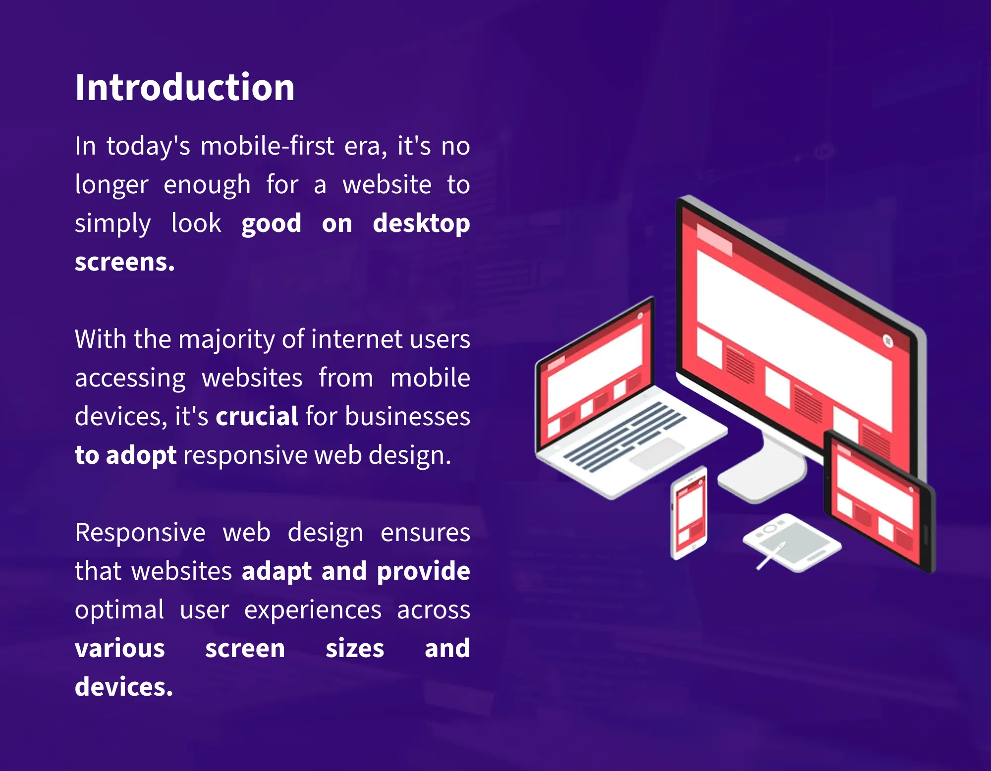
In today's mobile-first era, it's no longer enough for a website to simply look good
on desktop screens. With the majority of internet users accessing websites from
mobile devices, it's crucial for businesses to adopt responsive web design.
Responsive web design ensures that websites adapt and provide optimal user
experiences across various screen sizes and devices.
In this blog, we will explore some essential tips and tricks for implementing
responsive web design in the mobile-first era. Want to know more? We would love
to help you!
1. Embrace a Mobile-First Approach
When designing a responsive website, start with a
mobile-first approach. Begin by creating a design specifically for mobile devices,
focusing on essential content and functionalities. This approach ensures that your
website is streamlined and optimized for smaller screens, providing a seamless
experience for mobile users. As the screen size increases, you can progressively
enhance the design to accommodate larger devices.
2. Prioritize Content Hierarchy and Readability
In responsive web design, content hierarchy plays a vital
role in guiding users' attention and ensuring readability across different screen
sizes. Prioritize the most important content and place it prominently on mobile
screens. Use headings, subheadings, and bullet points to break down content into
digestible chunks. Pay attention to font sizes, line spacing, and contrast ratios to
ensure readability on various devices.
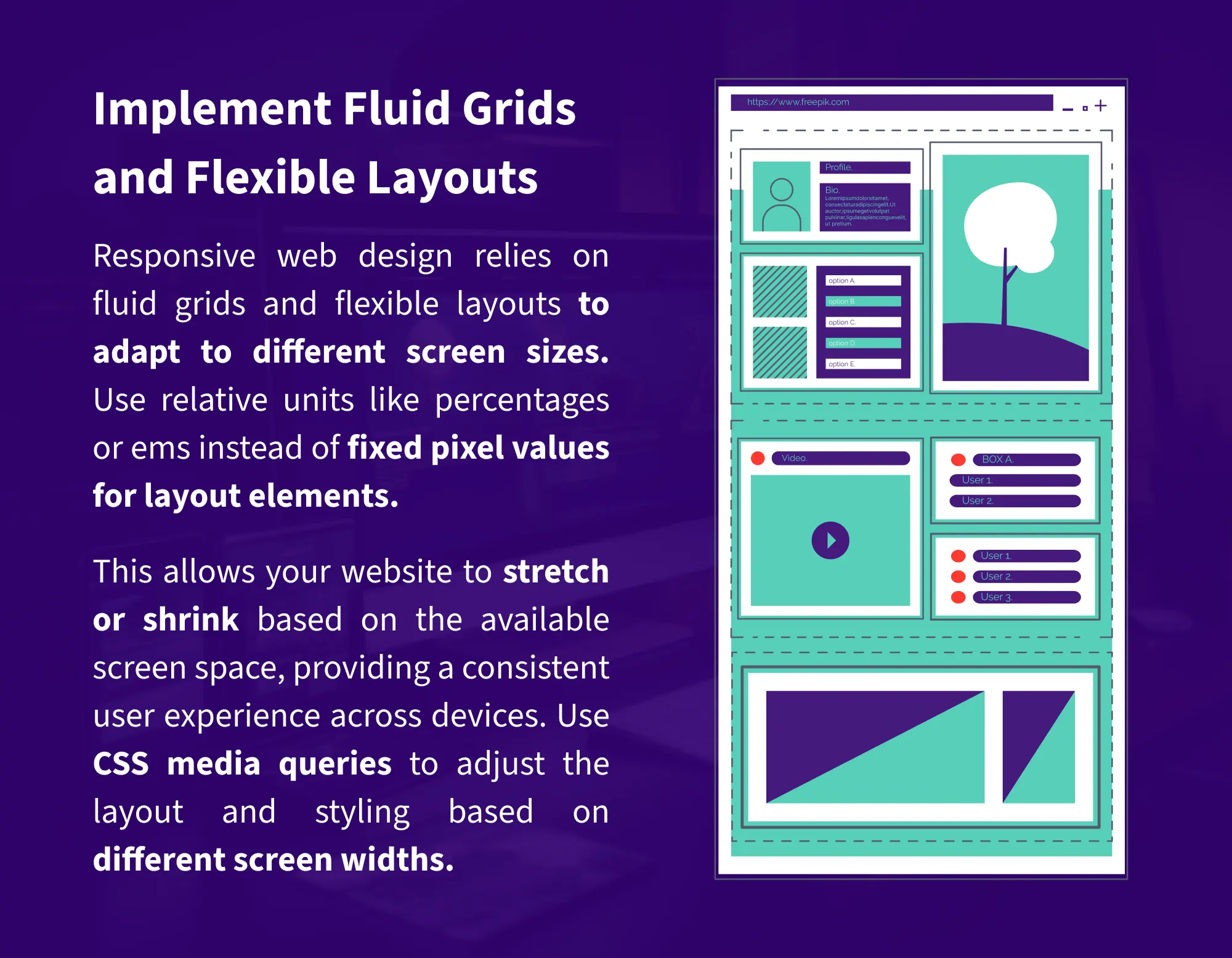
3. Implement Fluid Grids and Flexible Layouts
Responsive web design relies on fluid grids and flexible
layouts to adapt to different screen sizes. Use relative units like percentages or
ems instead of fixed pixel values for layout elements. This allows your website to
stretch or shrink based on the available screen space, providing a consistent user
experience across devices. Use CSS media queries to adjust the layout and styling
based on different screen widths.
4. Optimize Images and Media
Images and media elements can significantly impact the
performance and user experience of a responsive website. Optimize images by
compressing them without compromising quality. Consider using responsive image
techniques like srcset and sizes attributes to serve appropriately sized images
based on the device's capabilities. For media elements like videos, use HTML5 and
ensure they are responsive and playable on various screen sizes.
5. Test Across Multiple Devices and Screen Sizes
Testing is crucial to ensure that your responsive design
works seamlessly across a wide range of devices and screen sizes. Utilize device
labs, browser emulators, and responsive design testing tools to assess your
website's performance on different platforms. Check for layout inconsistencies,
navigation usability, and overall user experience. Regularly test and iterate on
your design to address any issues that arise.
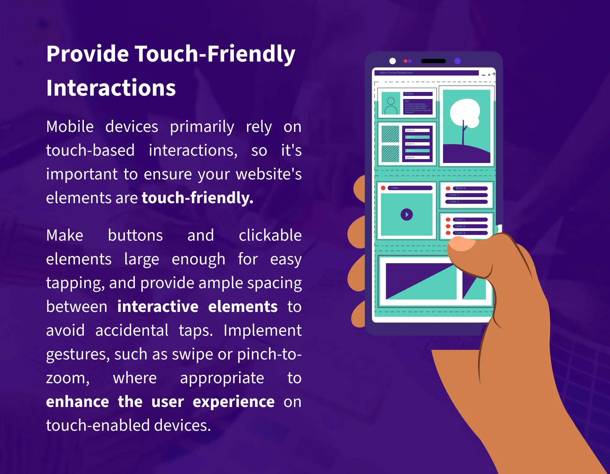
6. Provide Touch-Friendly Interactions
Mobile devices primarily rely on touch-based interactions,
so it's important to ensure your website's elements are touch-friendly. Make buttons
and clickable elements large enough for easy tapping, and provide ample spacing
between interactive elements to avoid accidental taps. Implement gestures, such as
swipe or pinch-to-zoom, where appropriate to enhance the user experience on
touch-enabled devices.
7. Optimize Page Load Speed
Page load speed is crucial for providing a positive user
experience on mobile devices. Optimize your website's performance by minimizing file
sizes, leveraging browser caching, and reducing the number of server requests.
Compress CSS and JavaScript files, optimize code, and use content delivery networks
(CDNs) to serve static assets. A fast-loading website not only improves user
experience but also contributes to better search engine rankings.
8. Monitor and Adapt to User Behavior
Responsive web design should be an ongoing process that
evolves with user behavior. Monitor user interactions, track analytics, and collect
feedback to understand how visitors engage with your website across different
devices. Use this data to make informed decisions and iterate on your design to
continually enhance the user experience. Read here, 8 Things to Consider before Writing Blogs for Your Customers.
Conclusion
In the mobile-first era, responsive web design is no longer an option but a
necessity. By following these tips and tricks, you can create a seamless and
user-friendly experience for visitors across various devices and screen sizes.
Embrace a mobile-first approach, prioritize content hierarchy and readability, and
optimize images and media elements.
Test extensively, provide touch-friendly interactions, and optimize page load speed.
Stay attentive to user behavior and adapt your design accordingly. By implementing
responsive web design best practices, you can ensure your website remains
accessible, engaging, and effective in the ever-expanding mobile landscape.


 Related Articles :